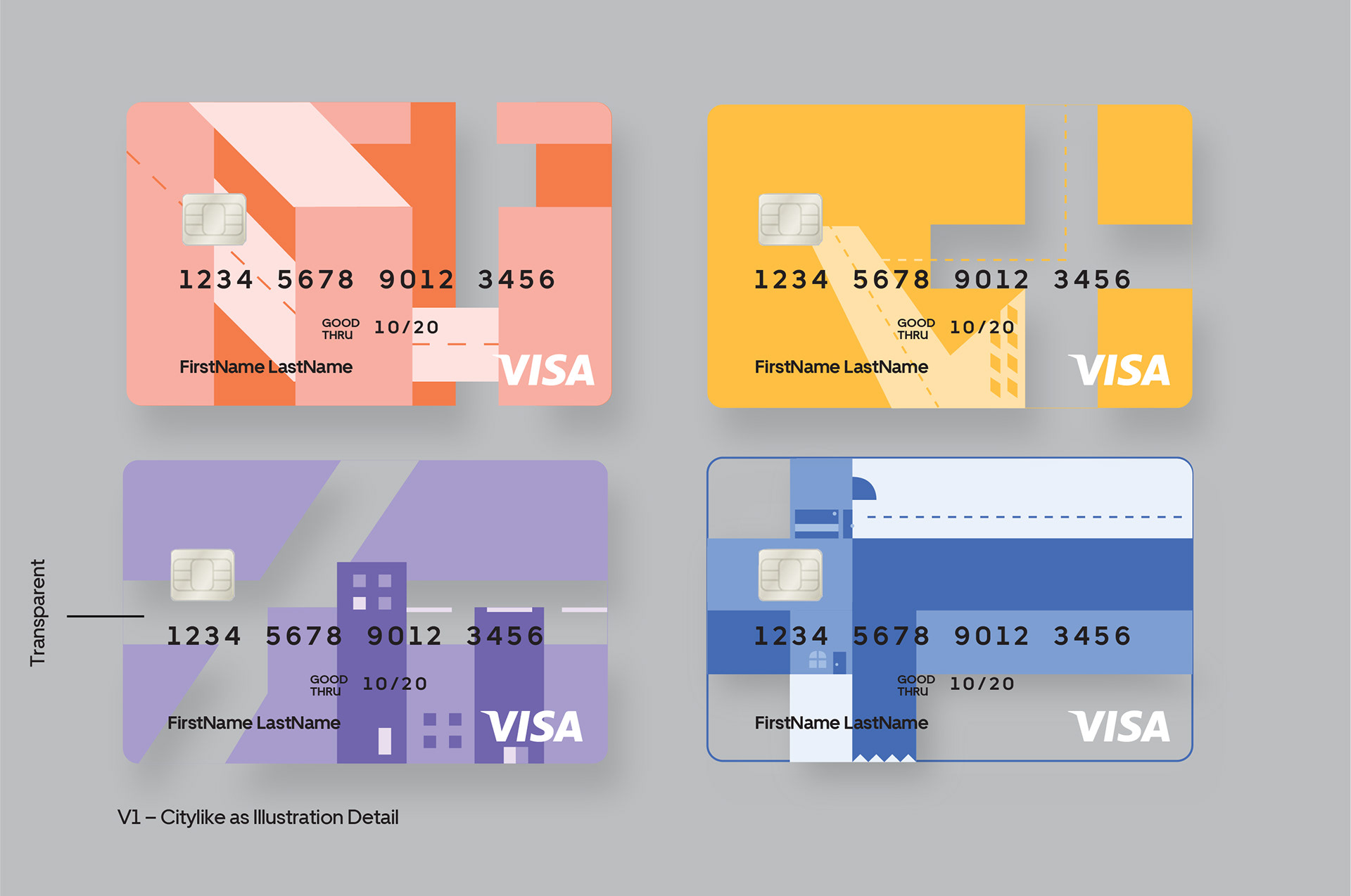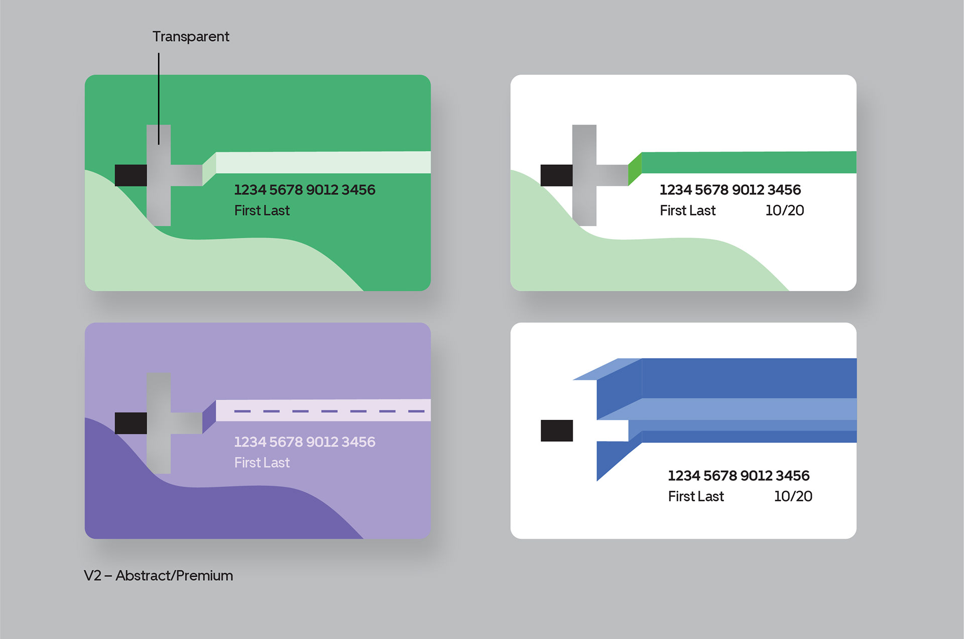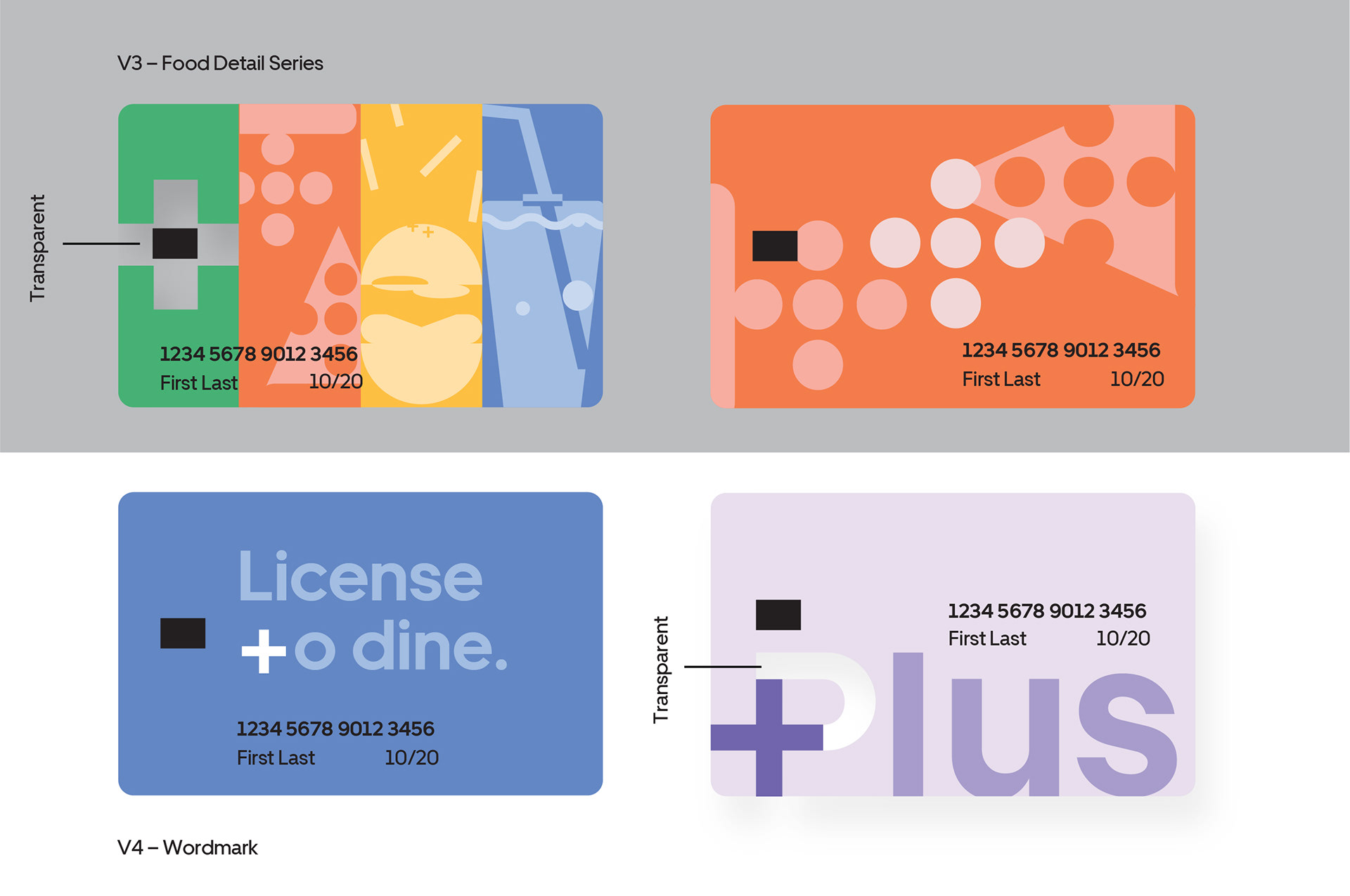
By adopting the existing color palette and mimicking the illustration style of Uber’s brand, I’ve proposed four design directions of the Uber Plus card. This credit card arrives in the mail along with instructions to activate within the merchant’s app to pay in advance for Uber Eats orders placed.
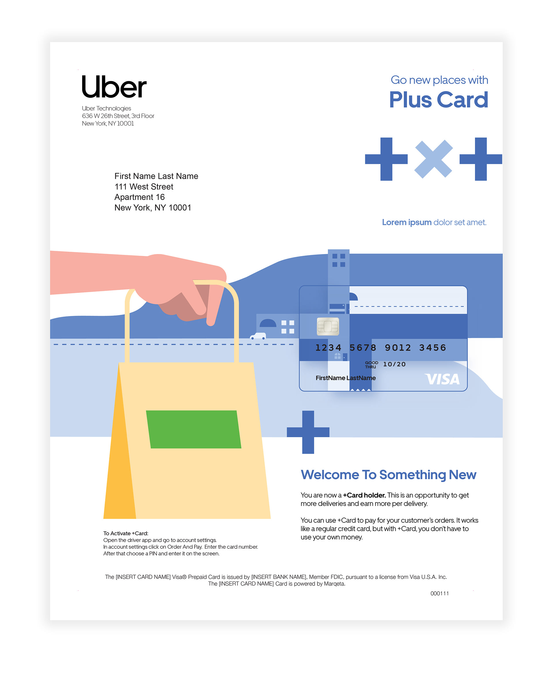
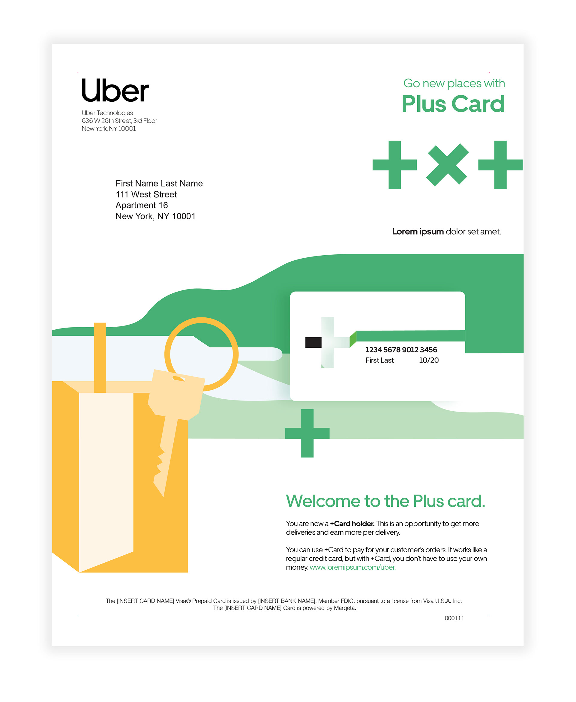
It was of best interest to create a card design that is recognizable to the Uber brand color, encouraging transparent material for the physical card as negative space is a large component of Uber’s illustration style. This approach creates engaging direct mail designs as a holistic design system that evolves from the card design itself.